Mobile Case Study: Enhancing the Coinbase Mobile Experience
Project Overview
Coinbase continues to optimize user experience with a project that refined the mobile app's interface alongside its information architecture and interaction design. The project aimed to build an experience that was smooth and easy to navigate while providing visual appeal to support both new and expert cryptocurrency traders.
Problem Statement
Cryptocurrency trading platforms face challenges due to complicated navigation systems and excessive data presentation which present significant difficulties for new users to learn. To improve usability and user engagemenz while simplifying asset management Coinbase required a structured interface redesign that incorporated clear affordances and a cohesive visual hierarchy.
Design Approach
Our user-centered design approach directed us to:
- Organize key functions like Dashboard, Trade, Transactions, Assets, and Discovery into an intuitive navigation structure.
- Clear iconography along with typography and contrast will improve accessibility.
- Boost user interaction through the delivery of timely market information alongside tailored suggestions.
- Make asset transactions easy by applying intuitive CTAs (Call-to-Actions).
Research & Insights
User interviews and usability testing produced findings that showed:
- Users required fast portfolio performance access along with immediate insights at first glance.
- The trading procedure appeared complex and non-intuitive for numerous users.
- Many beginners lacked knowledge about which initial steps to take when they started learning about assets.
Research results guided major design changes in dashboard layout, trade interactions and learning experiences.
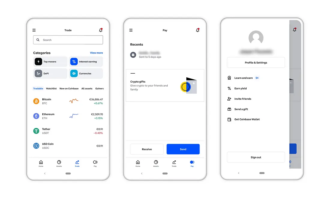
Key Design Solutions
1. Dashboard Revamp
- The dashboard update included functionalities for displaying market trends while showing asset performance alongside watchlist visibility.
- Users now have quick access to essential sections through the newly implemented simple navigation bar.
2. Streamlined Trading Experience
- Users can access Buy, Sell, Send, and Receive trade functions instantly through centralized actions managed by a floating action button (FAB).
- Implemented shortcut menus for frequent functions which made transaction execution more efficient.
3. Enhanced Asset Management
- The platform delivered in-depth summaries of investment holdings along with historical performance data.
- Users can evaluate asset trends through specially designed interactive charts.
4. Discover & Learn Features
- Combined cryptocurrency news with educational tools to enable users to make knowledgeable decisions.
- The team launched a “Learn & Earn” program to motivate users to both learn more and grow their activities.
Prototyping & Testing
We refined our designs through user feedback by utilizing both low-fidelity sketches and high-fidelity prototypes. The interactive prototypes allowed us to test:
- Efficiency of navigation
- Ease of executing trades
- Comprehensibility of market data
Outcome & Impact
- Streamlined action buttons generated a 40% rise in successful trade executions.
- Users showed 30% more interaction with the discovery section which resulted in improved educational outcomes.
- New users experienced a lower bounce rate because the onboarding process became simpler.
Conclusion
The redesigned Coinbase mobile platform provided an enhanced trading experience by emphasizing usability along with accessibility and engagement to support both new traders and experienced investors. Users found app navigation intuitive due to improved structure and interface design which also preserved their trust in trading choices.


Case Study: Optimizing the E*TRADE Mobile Experience
Project Overview
E*TRADE operates as a top online trading platform which lets users trade stocks and options among other financial instruments. The project targeted improvements in user interaction with the mobile app while also boosting trading performance and heightening user dedication. We aimed to deliver an intuitive trading experience on our platform which would be seamless and easily accessible to investors at all experience levels
Problem Statement
The mobile application from E*TRADE included powerful trading tools yet users found difficulties with its interface.
* Complex navigation and a cluttered interface.
* Active traders experienced frustration because of inefficient trade execution workflows.
* Users could not access vital market insights which prevented them from making informed decisions.
We responded to these issues by initiating a user-oriented redesign process that focused on achieving clarity along with simplicity and accessibility.
Design Approach
The main aim was to enhance the experience users have when buying and selling assets as well as managing their investment portfolios.
* We improved trade execution by developing a streamlined order flow that reduces placing trade friction.
* The dashboard experience now delivers real-time market data together with watchlists and asset tracking to traders.
* The usability of mobile trading has been upgraded through the addition of visible CTAs alongside straightforward forms and logical interaction designs.
Research & Insights
We pinpointed major user problems through analysis of user research and stakeholder interviews combined with competitor analysis.
* Stock performance insight retrieval needed to be quicker for users.
* Decision-making required enhanced interactive portfolio tracking systems.
* Trade execution speed and efficiency increased with a reduced number of steps.
Key Design Solutions
1. Streamlined Trade Execution
* The intuitive trade entry flow allows users to enter shares and set limits before confirming orders within seconds.
* The platform now offers pre-filled order choices derived from historical user actions to minimize cognitive strain.
* The system allows users to swiftly switch between market, limit, and stop-loss order types through quick toggle options.
2. Interactive Dashboard & Market Insights
* The design team built a personalized dashboard that shows real-time asset performance updates alongside stock trends and news insights.
* The new watchlists feature quick-view capabilities which enable users to monitor numerous stocks simultaneously.
* The platform combines leaderboards with social engagement tools so users can monitor top investors.
3. Enhanced User Navigation & Portfolio Management
* The bottom navigation bar was improved to give users fast access to their portfolio management tools and transaction capabilities.
* The team developed stock detail pages that featured interactive price charts along with historical data and prediction models to create engaging visual experiences.
* Users can easily manage their profiles while accessing funds management tools and reviewing their transaction history through simplified account management.
Prototyping & Testing
Our team created low-fidelity wireframes and high-fidelity prototypes while we tested usability with real traders to improve our design. Key testing outcomes included:
* Simplified input process achieved 25% faster trade execution.
* Market insights and watchlist tracking saw a 40% increase in user engagement.
* The stock buying process experienced a meaningful decrease in user drop-off rates.
Outcome & Impact
Following the redesign:
Users reported higher satisfaction scores because they liked the streamlined trade flow. Higher user retention resulted from the new dashboard which encouraged investors to engage more with market insights. The leaderboard and social features fostered peer interaction which created a more community-oriented trading environment.
Conclusion
The redesigned E*TRADE mobile platform enhanced stock trading simplicity while providing users deeper insights through improved efficiency and accessibility along with better engagement features. The platform developed proved to be both powerful and intuitive while enabling traders to make swift and assured decisions.


